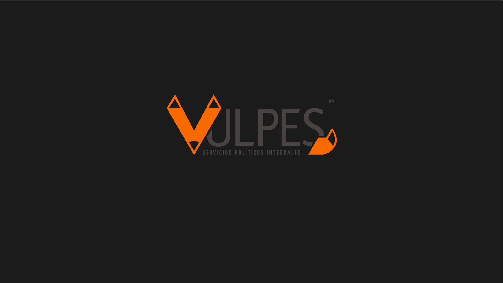
Vulpes
Vulpes a geometric brand identity for a political image management studio.
Sharp, discreet, and built
for the political arena.

Vulpes is an entrepreneur-led political image management studio offering integral political services. They came with a name, a clear personality, and one specific request: they wanted a fox in it. The brief was to build a complete visual identity that felt authoritative and sophisticated, without giving too much away.
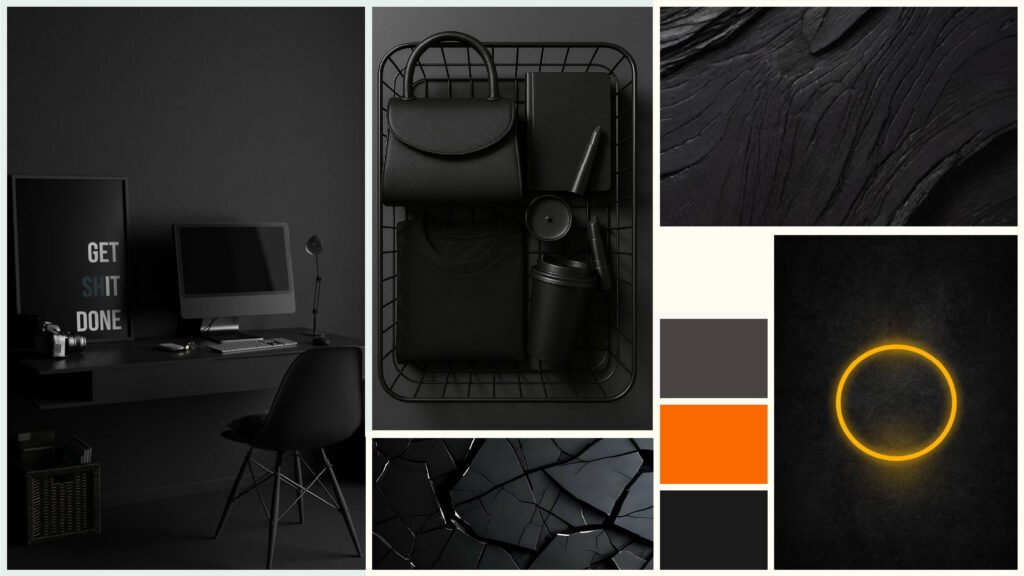
Political image management is a field where discretion is everything. The brand needed to feel strong and credible to high-profile clients, while remaining understated enough to never overshadow the politicians it represents. The tension between presence and restraint was the central design problem.
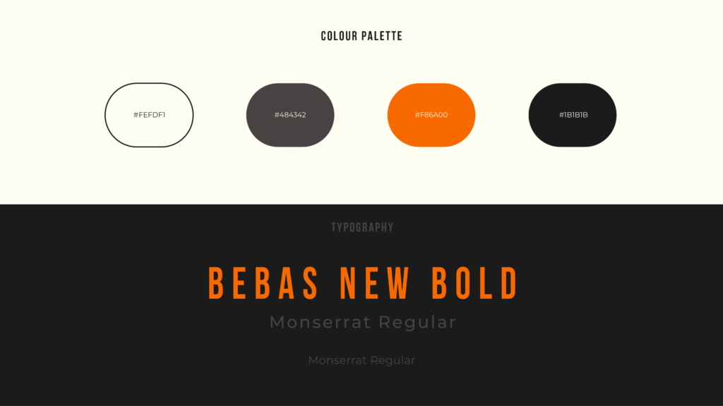
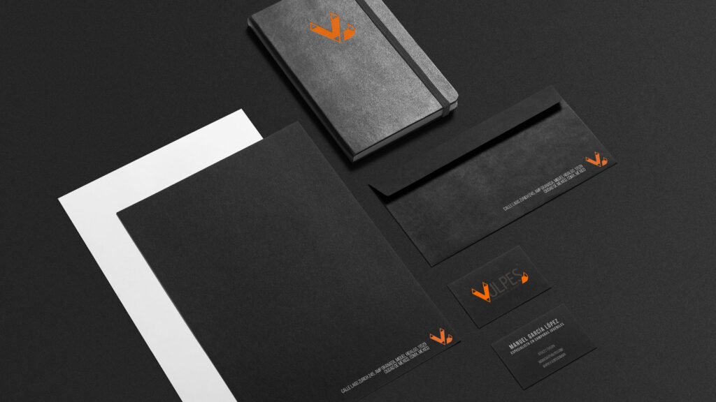
The fox, a symbol of intelligence, strategy, and agility, was abstracted into a geometric mark that doubles as the letter V. That decision was deliberate: the logo works at full size as a bold statement, and as a standalone icon, it becomes almost invisible, just a shape, which is exactly what a political operator needs. Black was chosen as the dominant colour, projecting authority and seriousness. The burnt orange accent cuts through with energy and confidence, keeping the identity from feeling cold. Together, they create a palette that feels both powerful and controlled.
The result
A complete brand system delivered across logo suite (primary mark and geometric V icon variation), colour and typography guidelines using Bebas New Bold and Montserrat, brand manual, corporate stationery, presentations, and infographics, built in Adobe Illustrator and Photoshop.
“The logo variation is what I’m most proud of; that level of discretion is exactly what someone in political image management needs to operate.”
Like what you see?